How Logo Types Shape Brand Perception?
Your logo is more than design, it is a signal. Different types communicate trust, creativity, or authority, shaping how people see your brand instantly.

What if the logo you chose is quietly repelling the very customers you most want to attract? Not because it looks bad. Not because the colours are off or the font is wrong. But because the type of logo you picked is sending the wrong signal entirely. Before a price is quoted, before your website loads, before a single word of copy is read, your logo is already speaking on your behalf.
The question worth asking is: do you actually know what it’s saying?
Most business owners treat a logo as a design task. Choose a colour palette, pick a font, use a template, and move on. But that approach skips the most important decision: the type of logo itself.
A wordmark behaves differently from a pictorial mark. An emblem communicates something entirely different from a combination mark. Each carries its own visual language, its own associations, and its own role. Choosing the wrong type doesn’t just look off, it works against how the brand is understood.
The brands people trust instinctively made deliberate choices here. Google uses a wordmark because the name is the product. Apple moved beyond text because the symbol says enough. IBM relies on initials because authority doesn’t need explanation. Starbucks evolved into an emblem as the brand grew beyond its name.
The same logic applies to your business. Whether you’re launching a consultancy, opening a café, or building a product, the question isn’t just how your logo looks, it’s what it’s meant to do.
Are you building recognition from scratch or leveraging existing equity? Do you want your logo to explain what you do, or create a feeling before anything is understood? Are you signalling heritage or something new? These are not design decisions. They are business decisions and they should be clear before any design work begins.
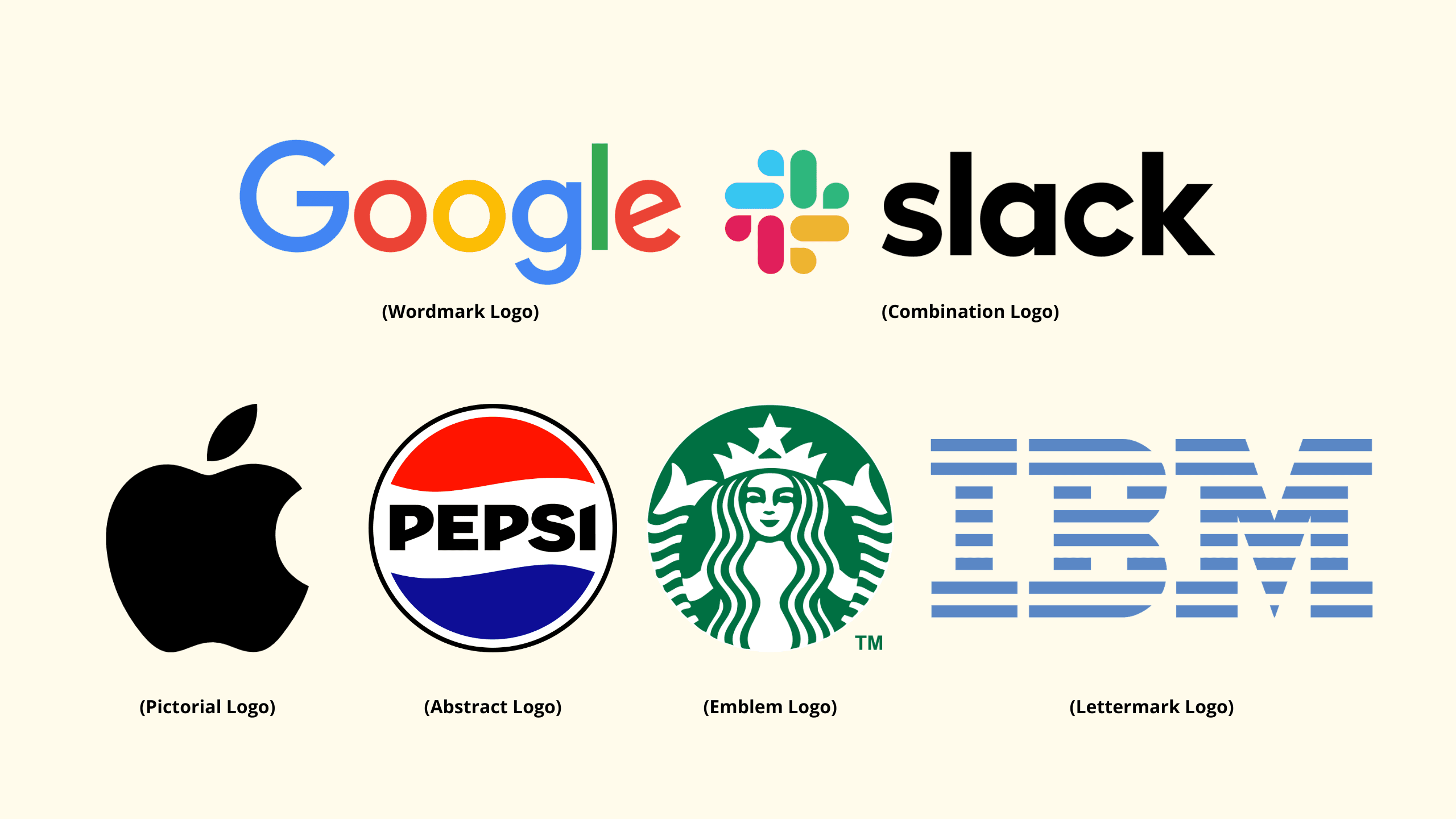
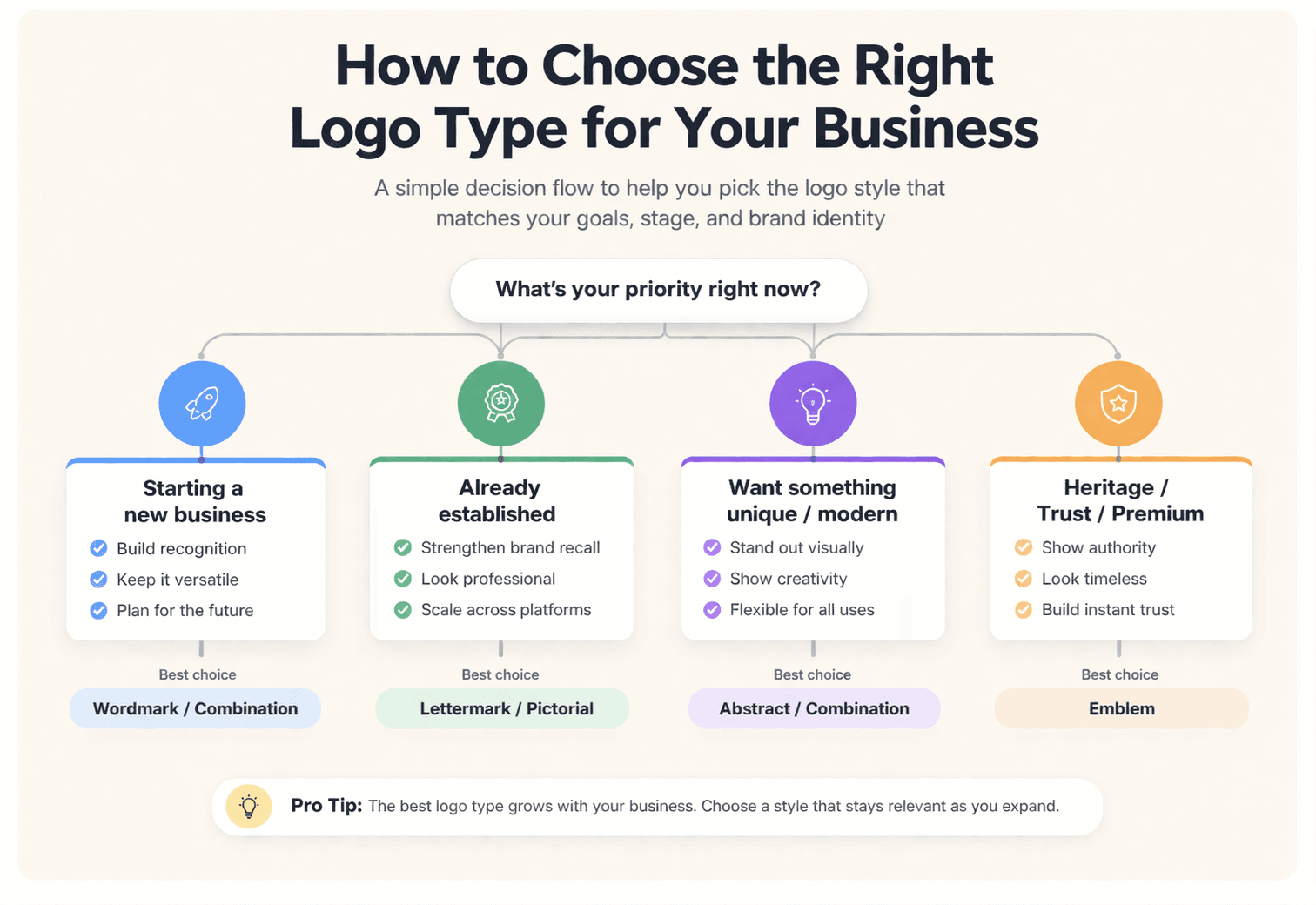
Below is a breakdown of the six core logo types, what they communicate, where they perform best, and how to assess what fits your business right now.
1. Wordmarks: When Your Name is the Brand
A wordmark uses the business name itself, styled in a distinctive typeface. Think Google, Coca-Cola, or FedEx.
- What it signals
Confidence in the name. The brand relies on recognition and repetition, not symbols. - Where it works
Short, distinctive names. Businesses building awareness. Common in consultancies, personal brands, and early-stage companies. - How it feels
Clear, direct, and professional. Wordmarks often feel established and easy to trust. - Watch out for
Long or generic names weaken impact. The typography carries the entire identity, so it needs to be considered, not default.
2. Lettermarks: Making Initials Work for You
A lettermark uses initials instead of the full name. Think IBM, HBO, or NASA. It’s a more compact version of a wordmark.
- What it signals
Clarity and efficiency. Often used by businesses with longer names or those that have built enough recognition to shorten them. - Where it works
Multi-word or descriptive names. Established businesses. Brands operating in corporate or technical environments. - How it feels
Clean, structured, and direct. Lettermarks tend to feel more formal and system-led. - Watch out for
If the name isn’t already known, the initials don’t carry meaning on their own. Without context, they can feel generic. Recognition needs to come first.
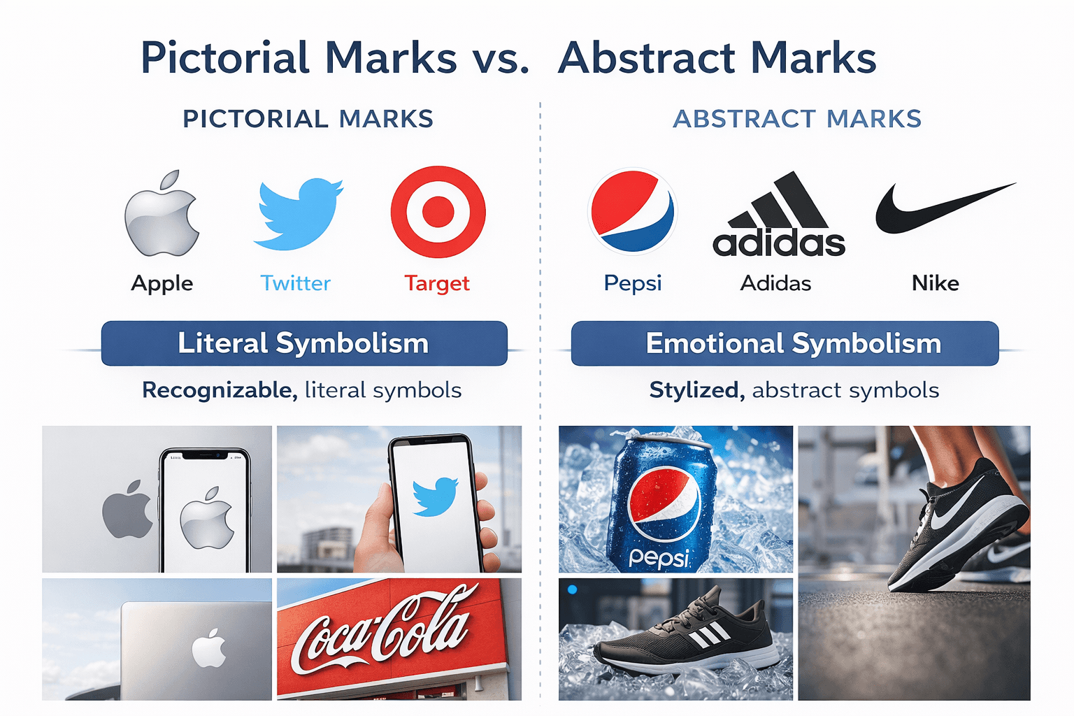
3. Pictorial Marks: The Power of a Single Image
A pictorial mark uses a symbol or icon to represent the brand. Apple, Twitter, and Target are clear examples.
- What it signals
Strong recognition. The brand can be identified without relying on its name. - Where it works
Brands with established presence or a clear visual idea that can be consistently applied across channels. - How it feels
Confident and distinctive. When done well, it’s simple, memorable, and easy to recognise at any size. - Watch out for
For newer businesses, the symbol can lack meaning without prior exposure. The idea behind it needs to be clear and repeatable, not just visually appealing.
4. Abstract Marks: Emotion Over Literal Meaning
Abstract marks use shapes and forms that don’t represent anything directly. Think Pepsi or Adidas.
- What it signals
A brand built on feeling, not description. Often associated with innovation, creativity, and movement. - Where it works
Brands that aren’t tied to a single product or want room to evolve over time. - How it feels
Distinctive and flexible. It doesn’t explain, it suggests. - Watch out for
Without intent, it can feel random. If the idea behind it can’t be explained simply, it won’t hold meaning over time.
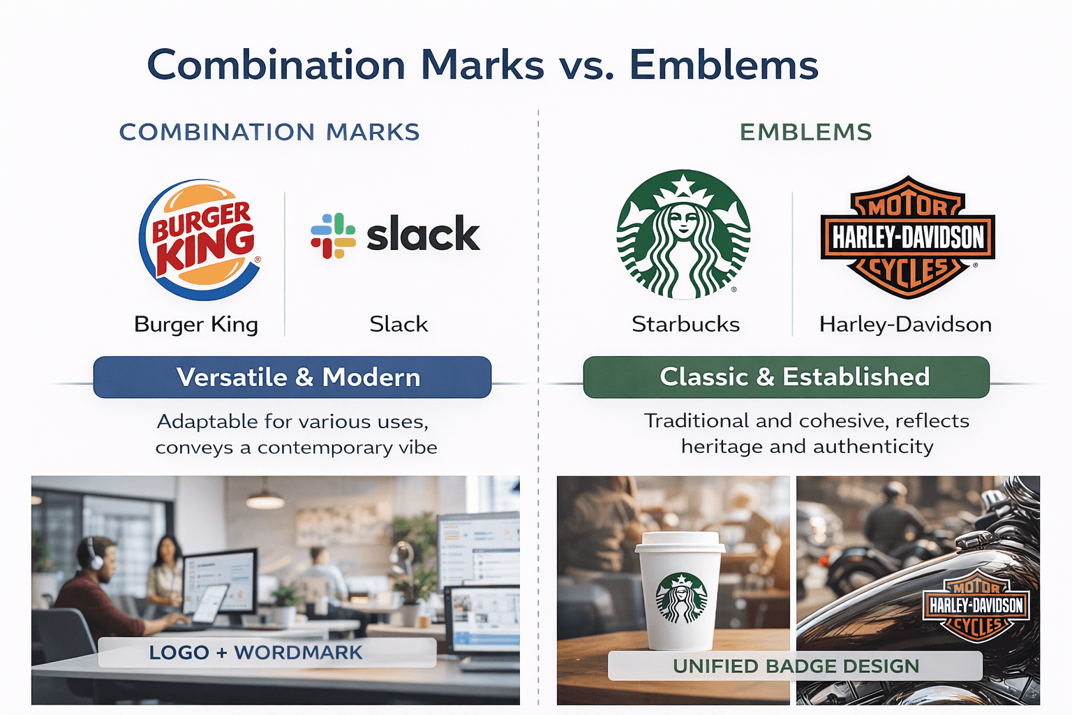
5. Combination Marks: The Best of Both Worlds
A combination mark pairs a symbol with the business name. Common across growing brands.
- What it signals
Clarity and flexibility. You’re building recognition while still introducing the brand. - Where it works
Small to mid-sized businesses. Brands in growth phase. Most practical starting point. - How it feels
Balanced and adaptable. Works across digital, print, and signage without losing clarity. - Watch out for
Overcrowding. The symbol and name need to support each other, not compete.
6. Emblems: Traditional, Bold, and Instantly Credible
Emblems place text and imagery inside a contained shape like a badge or seal.
- What it signals
Heritage, authority, and structure. Often tied to trust-led industries. - Where it works
Hospitality, education, legal, craft, or any space where credibility and tradition matter. - How it feels
Established and formal. Carries weight immediately. - Watch out for
Scalability. Detail can get lost at smaller sizes, especially in digital use.
How to Choose the Right Logo Type for Your Business
A simple way to approach it:
- New business with a strong name → wordmark or combination mark
- Personal brand → wordmark or lettermark
- Creative or design-led business → pictorial or abstract
- Tradition-led industries → emblem
- Established brand simplifying → pictorial or lettermark
Above all, remember this: your logo is not your brand. It is a symbol of your brand. The most powerful logos earn their face value over time, through consistent delivery on the promise your brand makes.
Choosing a logo type isn’t just a design decision. It’s a business decision. The right logo communicates your value, attracts your ideal customer, and gives your business a visual shorthand that works 24/7, even when you’re not in the room.
Before you brief a designer (or open Canva), ask yourself: what do I want someone to feel the moment they see my brand? Let that answer guide your logo type, and the rest will follow.


